EN
EN
 AR
AR
 BG
BG
 DA
DA
 NL
NL
 FI
FI
 FR
FR
 DE
DE
 IT
IT
 JA
JA
 KO
KO
 NO
NO
 PT
PT
 RU
RU
 ES
ES
 IW
IW
 TH
TH
 MS
MS
 HY
HY


Maintaining color consistency across brand logos is crucial when customizing packaging. Therefore, Pantone printing is far superior to CMYK printing when color consistency is required.
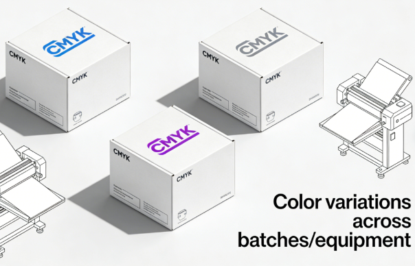
CMYK printing produces various colors by mixing inks, but it is prone to subtle color variations between different batches and on different equipment. This results in inconsistent printing effects on the final packaging, which is detrimental to companies seeking consistent brand colors, weakening brand recognition.
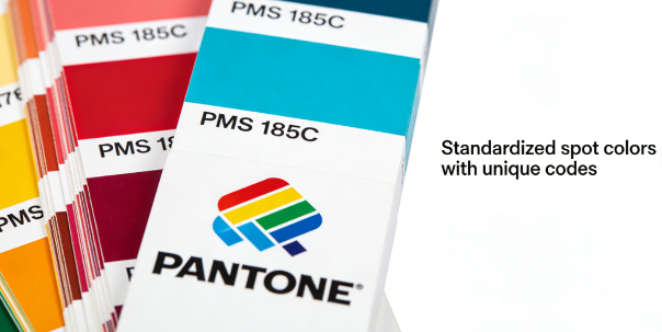
Pantone colors use pre-mixed, standardized spot color inks, each with a unique code. This ensures that the packaging, regardless of the factory or batch, reproduces the original, accurate color, thereby increasing brand recognition, professionalism, and visual impact.
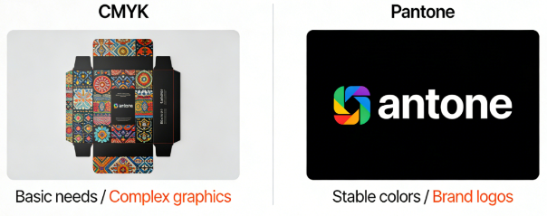
Therefore, CMYK printing is suitable for basic printing needs, while Pantone printing is suitable for packaging requiring stable and consistent colors. Of course, the two can be combined: complex patterns can use CMYK printing, while brand logos can use Pantone printing to create the highest quality packaging.
Contact Jinayon for one-stop packaging solutions.

FAQ
Why does my brand logo need Pantone instead of CMYK printing?
Pantone uses pre-mixed spot inks with unique codes to guarantee exact color reproduction every time, while CMYK blends four inks and can vary between print runs, risking inconsistent brand colors.
Can I use both Pantone and CMYK in the same packaging design?
Yes, this hybrid approach is common. Use Pantone for critical brand elements like logos to ensure color fidelity, and CMYK for complex images or backgrounds to manage costs effectively.
Is Pantone printing more expensive than CMYK?
Typically yes, due to custom ink mixing and additional press setups. However, the investment ensures brand integrity and recognition, making it valuable for logos and signature brand colors.