EN
EN
 AR
AR
 BG
BG
 DA
DA
 NL
NL
 FI
FI
 FR
FR
 DE
DE
 IT
IT
 JA
JA
 KO
KO
 NO
NO
 PT
PT
 RU
RU
 ES
ES
 IW
IW
 TH
TH
 MS
MS
 HY
HY


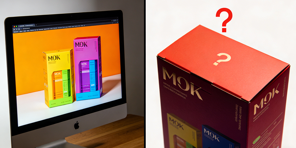
A common problem encountered when customizing packaging is color difference between the screen display and the printed packaging. This is one of the most frequent issues in packaging production, leading to inconsistent brand colors and high reprint costs. We'll break down the reasons behind this quickly.
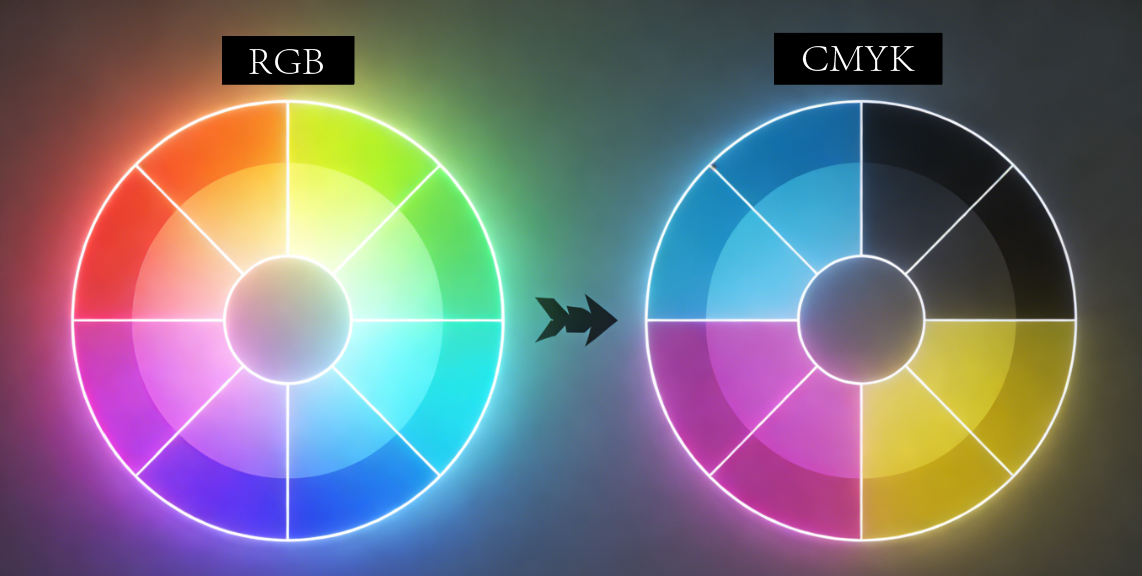
Most designs are based on RGB mode, but this mode is only suitable for screen display. For printing, CMYK or Pantone files are needed to accurately reproduce the product. Therefore, the primary reason is likely that RGB files are directly printed using CMYK without conversion, resulting in color deviations. Colors typically appear darker and less saturated.
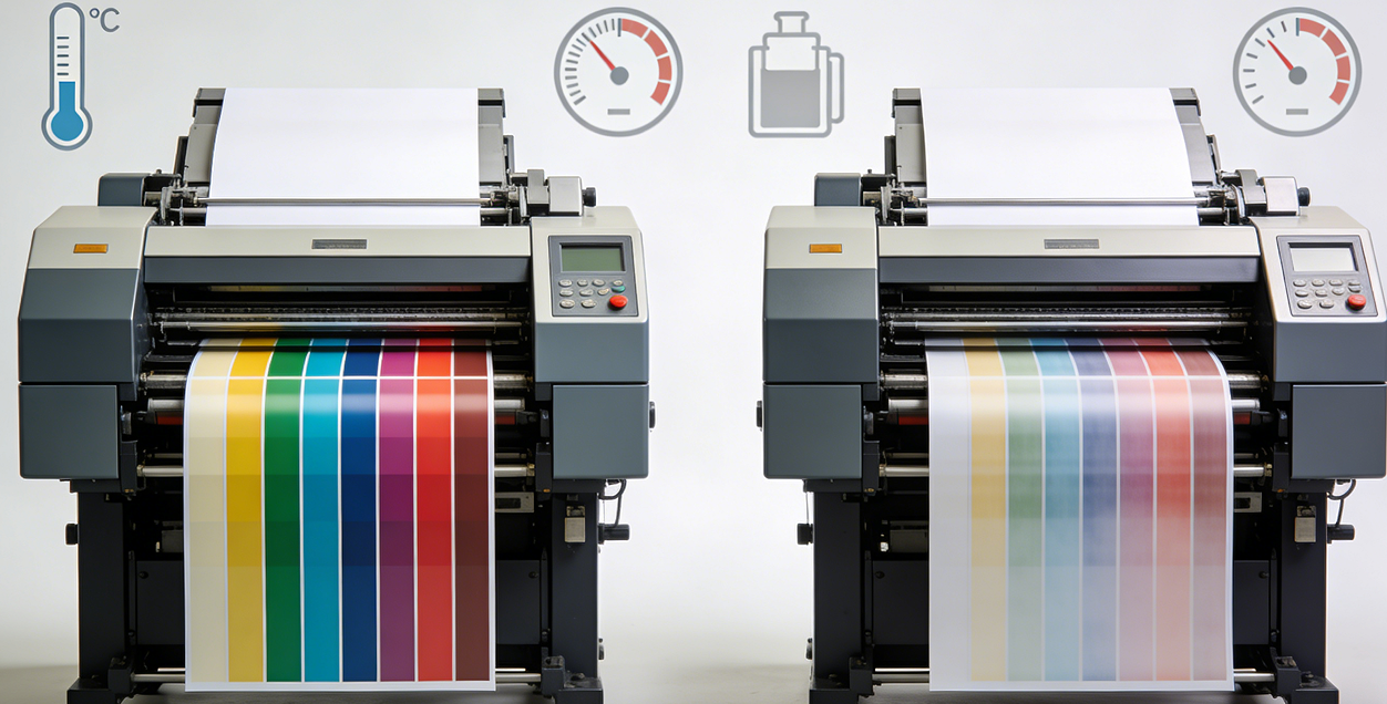
Secondly, uncalibrated printing presses exacerbate this problem. Over time, factors such as printing machine parameters, ink, and environment can cause the equipment to deviate from its calibration state. Furthermore, the same packaging might be printed in factories in different regions, and different printing equipment can also cause color differences.
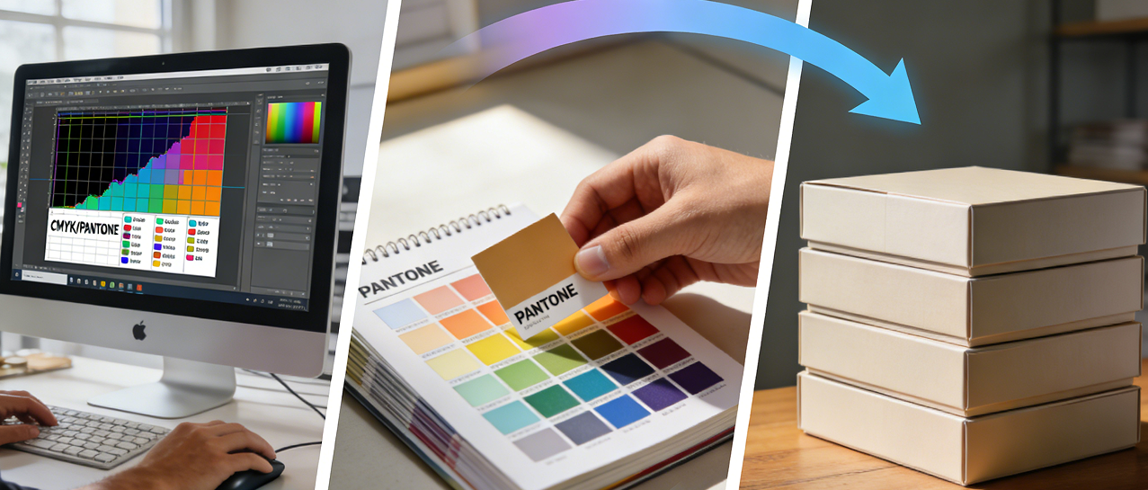
Therefore, to minimize color differences caused by printing, it's essential to prepare CMYK files before production and confirm the use of Pantone colors for the brand to ensure color consistency. Additionally, it's best to request a physical sample before mass production.
Color consistency helps build brand trust and enhances brand image. Contact Jinayon for product samples and to find packaging solutions with consistent color schemes.

FAQ
Why do my packaging colors look different from my screen design?
Screens use RGB colors while printing uses CMYK colors. Directly converting RGB files to CMYK often causes darker, less vibrant results because the color systems have different gamuts.
How can I ensure my brand colors print consistently every time?
Use Pantone spot colors for critical brand elements. Pantone provides standardized pre-mixed inks that remain identical across print runs, unlike CMYK which can vary between machines and batches.
Should I always request a physical proof before production?
Yes. A physical proof under natural light shows exactly how colors will appear on your specific paper stock. This critical step catches color issues before mass production, saving costly reprints.